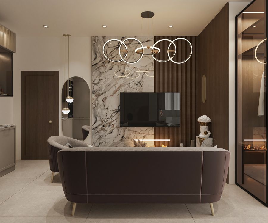
A reflection on winter material palettes and the quiet power of earthy tones, stone textures, and natural timber.
Winter light is low and forgiving. It favours materials with depth—honed stone, brushed brass, timber with visible grain—over anything glossy or flat. A palette built for the season leans into that: earth tones that hold shadow well, rather than colours that need direct sun to read correctly.
We tend to darken a scheme slightly for the cooler months, not by repainting, but by shifting the textiles and accessories: heavier linen, deeper timber tones in the styling layer, brass over chrome. The architecture stays constant; the mood adjusts around it.
The goal is a room that feels warmer than its actual temperature—achieved through material choice long before a fireplace or a lamp is switched on.